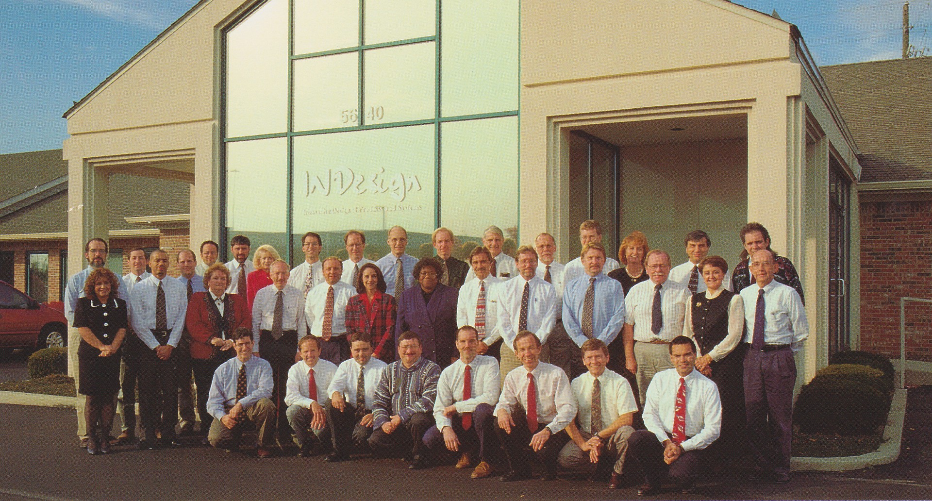
A little over 25 years ago, teams of people were planning to launch a new company. The code name for the new company was Phoenix as the teams were working for the consumer products division of AT&T Bell Labs/Lucent and those jobs were set to move from Indianapolis to New Jersey. Employment changes were required by all. A small group of people decided to stay in Indy and form an engineering design services company. Drafts of business plans had been written, and plans were being made for staffing, facilities, IT, and finance. Now it was time to come up with a “real” name for this enterprise. A name that could be put on the self-printed business cards and brochures. As with all activities for this fledgling company, then and now, we were all asked to be creative and submit ideas for the name of the new company.
How We Started
I remember thinking about possible company names on my drive home that day. Within the Bell Labs community, we were referred to as the Indianapolis Laboratories or “Indy Labs”. I was thinking of possible company names that would incorporate that part of our shared past. I really liked “INgineering”, but it looked funny, and I didn’t think the engineering team would allow it.
I sat at my Mac and started typing in different variations and finally hit on “IND”, the airport abbreviation for Indianapolis, and “Design”. Removing a duplicate D left INDesign. That seemed to work! I then went through all the fonts I had installed on my trusty Mac on this new combo word. I really liked the look of INDesign in a handwriting font I had recently downloaded. To me, in that font, the logo looked like something new, something just created and exciting. The logo had to be red for the same reason that Ferraris and roses are red. Red means passion and energy, and there sure was a lot of that with this group!
The next evening, team members submitted their ideas for names and logos, and there were many good ones. A series of votes were taken, with INDesign emerging as the selection. The tag line “Innovative Design of Products and Systems” was added to the logo. It was a thrill to see the logo on our first building on Caito Drive and on our first website.
Where We Are Now
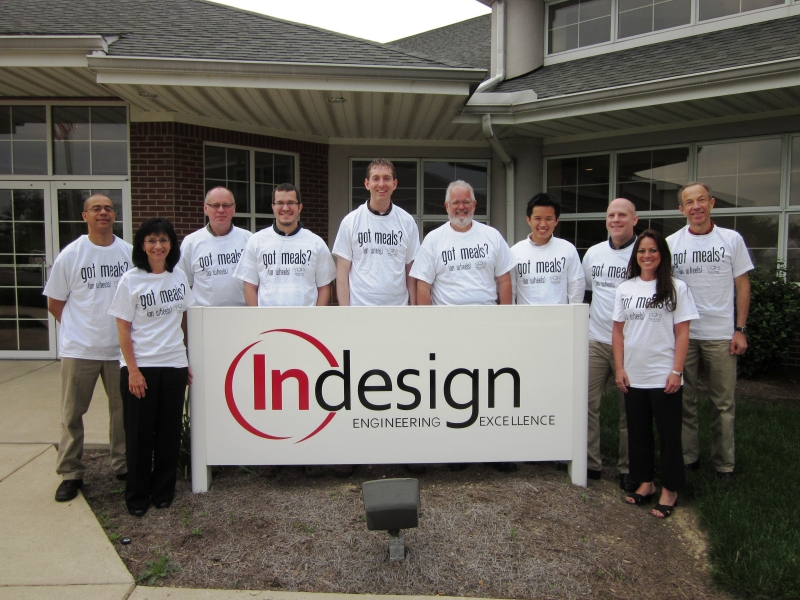
A few years after our start, a “real” professional logo was created. The spelling was changed to Indesign with the “In” remaining red, and the silly “new company” handwriting font was replaced with one better representing an established company. “Innovative Design” was replaced with “Engineering Excellence” and our logo has stayed that way ever since.
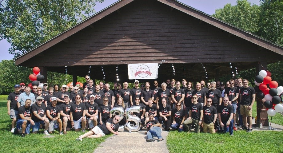
Obviously, the company would have been successful no matter what name was chosen. Shakespeare addressed that point a couple of centuries ago. Now 25 years later, Indesign has clients all over the world, and the staff has more than doubled in size. Indesign is a brand that represents the integrity and efforts of all the people that have worked here, and I’m very proud to be one of them.
Contact Us
With over 25 years of experience, Indesign, LLC, has developed a proven product development process for a variety of markets, beginning with product concept development and ending with design for manufacturing. If you are interested in learning more about our engineering and design services, contact us today at (317) 377-5450!
